Monday, May 8, 2017
Hail Seaborn!
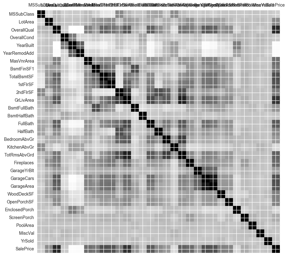
The
seaborn
heatmap perhaps is the best visualization of the correlations in a data set.
Much better than
Axes.matshow
():
No comments:
Post a Comment
Newer Post
Older Post
Home
Subscribe to:
Post Comments (Atom)


No comments:
Post a Comment